Illustration guidelines
As this is a design guide, it is only natural that much of our content uses imagery to communicate. Not only is it more appealing, but some concepts can also be more effectively communicated visually. Whether it’s flow charts, interface mock-ups, interactive prototypes, animations or videos, feel free to explore to find the best way to capture your ideas.
Creative direction #
The basic design of this website was intentionally kept minimal, so authors have more freedom to express their own creative ideas in the content they create. Experiment and express yourself, just keep in mind that the total experience of the guide should still be coherent to readers and allow for easy absorption of the content. Visuals should primarily be used for communicating content, not solely for decoration. Regularly discussing your ideas with others and getting feedback is the best way to ensure we can achieve this. Also, make sure to look around and take inspiration from what others have done.
Image sources #
We collaborate on visuals the same way we collaborate on text. Please make the source files for your illustrations publicly accessible. For file-based visuals (Sketch, Photoshop, etc.), use cloud hosting like a Github repository, Dropbox folder or another similar service. For Figma file, share a link to the source file.
Each markdown file should contain a comment at the top that includes links to these source files. For example:
<!--

Editor's notes

This page provides an overview to...

Illustration sources

- https://www.figma.com/file/qzvCvqhSRx3Jq8aywaSjlr/Bitcoin-Design-Guide-Illustrations-CO?node-id=862%3A2982

-->
File folders #
All images in the guide are located in the assets/images/guide folder. Create a subfolder that matches the URL of your page and place your images there.
For example, the URL for this page is:
/guide/contribute/illustration-guidelines/
Images for this page are located in:
assets/images/guide/contribute/illustration-guidelines/
File names #
Keep your file names in lowercase and avoid any special characters (including spaces). Keep them short and descriptive.
Don’t
My übercool image.PNG
Do
transaction-confirmation.png
JPG, PNG or GIF? #
For static images, use JPG or PNG. The two formats use different compression methods. PNG files are better for images with flat colors, while JPGs can compress photos and heavily textures visuals better. When in doubt, export both file types and see which one looks best at an acceptable file size.
For short animations, use GIFs. Be aware that GIFs can easily bloat in file size and have limited color depth.
Export images at the right sizes #

This ensures images render crisp and clear while keeping file download size and speed reasonable.
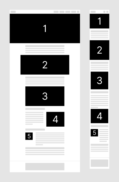
Overall, there are five layout options for images, each one resulting in a different image size. Additionally, desktop and mobile layout logic differ, and we also need to support regular and retina screen resolutions. The result is that each image needs to be exported at four different sizes. For examples, view the Media page.
Pay attention to the image width when you export. Image height is up to you, based on the image content.
Image width specifications are as follows, with widths provided in pixels. 2x images are for retina screens and always double the size of the regular image.
| Type | Purpose | width |
|---|---|---|
| 1. Header banner | Desktop | 1600 |
| Desktop 2x | ||
| Mobile | 400 | |
| Mobile 2x | ||
| 2. Extra wide | Desktop | 1024 |
| Desktop 2x | ||
| Mobile | 400 | |
| Mobile 2x | ||
| 3. Regular | Desktop | 800 |
| Desktop 2x | ||
| Mobile | 400 | |
| Mobile 2x | ||
| 4. Desktop inline | Desktop | <400 |
| Desktop 2x | ||
| Mobile | 400 | |
| Mobile 2x | ||
| 5. Small inline | Desktop | <400 |
| Desktop 2x | ||
| Mobile | <200 | |
| Mobile 2x |
Example image set:
my-ubercool-image.png
my-ubercool-image@2x.png
my-ubercool-image-mobile.png
my-ubercool-image-mobile@2x.png
Distinct landscape and mobile images #

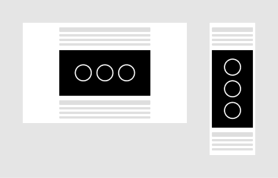
Create and specify differently laid out images for desktop and mobile as needed. Many times, using landscape images on mobile is problematic as the image gets so small that its content is no longer recognizable.
File size optimization #
Optimize your images before committing them. The easiest way is to build and run this repository locally. Images will be automatically compressed as you add them. After compression, ensure that the quality is still acceptable. Heavily textured images are sometimes heavily compressed, resulting in visible compression crystals, blurry lines and other visual artefacts.
Link preview images #
Social and messaging services typically show a preview image when sharing links. This is a custom image that needs to be prepared and defined in the front matter of each page. The file name should combine the page name and the -preview suffix, for example getting-started-preview.jpg for the Getting started page. The image resolution needs to be 1200x630px for best display across social networks, both JPG and PNG file types can be used. Twitter and Facebook provide handy link preview tools to check if your image turns out correctly.
Next, find out what options are available for formatting your content. Take a look.