
Activity
Every wallet includes a list of transactions that allow the users to see who they sent bitcoin to and who they received bitcoin from. This sounds straightforward, but there are many detailed design decisions to consider.
What is a transaction? #
On a technical level, a transaction is a transfer of a specific amount between two addresses at a given time. But as human beings, we think of a transaction as a grocery store purchase, a mortgage payment, or paying back a friend for lunch. We should strive to let users capture these additional layers of meaning so they can more intuitively navigate and work with their transaction history.
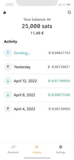
A minimal transaction list that avoids the display of technical details.
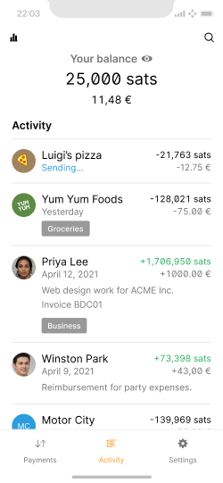
If users annotate transactions well, they see much richer history.
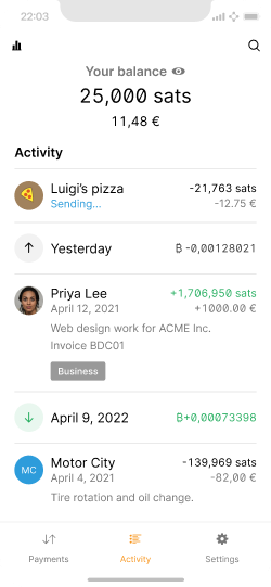
Unless a user is thorough about organization, they will see a mix of annotated activity and raw transaction information.
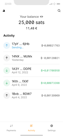
If your users are likely to rely on addresses or lightning invoice IDs to identify payments, you may decide to show them. Always consider your users.
Design considerations #
Research by the team at Alby has indicated that most users rarely visit a transaction list. The most common reasons to do so are to confirm payment status, budgeting, and to analyze payment behavior. The biggest challenges are navigating through endless lists to find a specific transaction and unavailable metadata, leaving users guessing who the payment was sent to and what for.
Activity is a utility screen where a user wants to quickly browse a data set to see what’s new, find something specific, identify patterns, etc. Be deliberate with every detail and avoid adding anything that adds visual interest without signal, unless you have good reason to.
Following are some of the design decisions in the screens above:
- Received amounts are green, which is typically a positive connotation. Highlighting sent amounts red seems like a logical follow-on decisions, but this is not necessary as there is enough contrast already. Red can remain the color associated with errors.
- Adding a plus or minus next to amounts is helpful for the color-blind, as well as general readability & usability.
- Fallback icons are designed to be subtle and useful by indicating whether bitcoin was sent or received, and the status of the transaction. When they are not shown, because there’s a contact image displayed instead, no information is lost. Showing a bitcoin symbol instead, for example, would be visually distracting without providing any useful information.
- The formatting guidelines in Units & Symbols are applied.
Not carefully weighing these decisions can easily result in a cluttered appearance.
Beyond transactions #
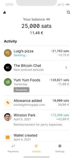
A list that includes non-payment activity.
Since we already offer users a chronological list of events, it is a small step to go beyond transactions and also include other relevant wallet activity.
User activity #
Events can include user activity related to unique wallet features. For example:
- Blixt allows for manual control over lightning channels. The list can show when channels were opened and closed.
- Breez includes a podcast player. New subscriptions and episodes could be listed.
- Hexa allows users to have multiple wallets. The list can show when new wallets were created.
- Authentication to third-party services via sign in with bitcoin.
Software notifications #
Wallets can also independently keep an eye on user funds, data traffic, and other aspects, and highlight activity that the user should be aware of right away, or be able to reference in the future. Especially with security and privacy, users rely on the software to keep an eye out for them.
Smart organization #
The lightning network makes micropayments economically and technically viable. For example, as a user listens to a podcast, they may stream 10 sats per minute to the host as a thank you. This can easily result in a cluttered activity list, which can be remedied via automatic grouping.
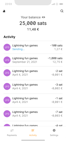
Micropayments can easily flood an activity screen and make it hard to use.
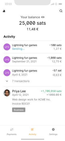
Smart grouping can help keep the list easy to parse.
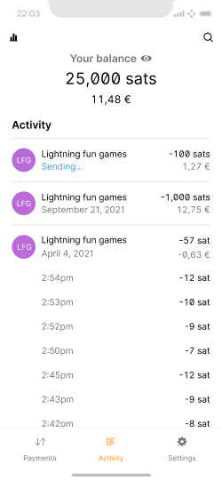
When expanded, the micropayment information can be kept to a minimum.
Search & export #
Search is helpful for anyone using a wallet somewhat regularly, especially if micropayments become more common. Since this functionality relies strongly on quality data, it should be very simple for users to add relevant metadata to transactions.
Closely linked to search is export, which can serve several purposes. For one, a user may want to migrate to a new wallet and take their transaction history with them. Second, it is useful for accounting and tax purposes, especially for merchants.
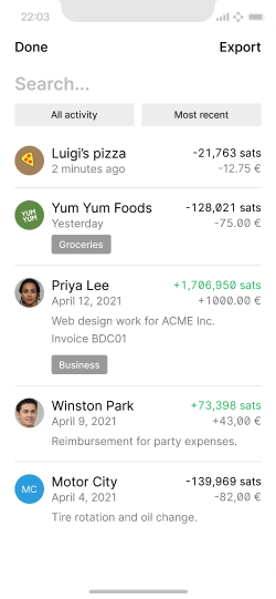
An example UI for search, filtering and export.
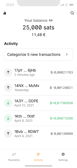
Wallets can support users in organizing transactions more easily.
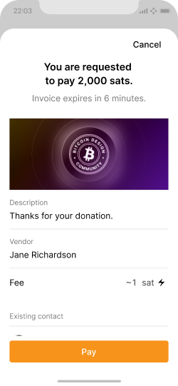
If an invoice includes a description or other useful data (e.g. BOLT 11), make sure to store it.
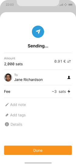
Make it easy to add metadata when a user sends or receives a transaction, as it is top-of-mind at that moment.
Different views #
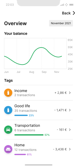
Example of a screen summarizing the users spending and receiving categories.
Alternative approaches to the basic list view can give users different perspectives on their finances and activity.
The example shown here uses traditional categories borrowed from personal household finance. As users tag transactions, the categories update.
It’s recommended to approach this type of view based on the unique use case and feature set of the application. For example, a wallet that is focused on interaction with lightning applications may instead group payments by the services they were made with.
Transaction details #
The activity list focuses on summarizing the top-level information, so users can quickly scan the screen to get an overview. If they identify a transaction they want to take a closer look at or interact with, the following screens become relevant.
A payment made on lightning #
As with the activity list, transaction details screens should also only highlight relevant information and options, and make secondary details easily accessible.
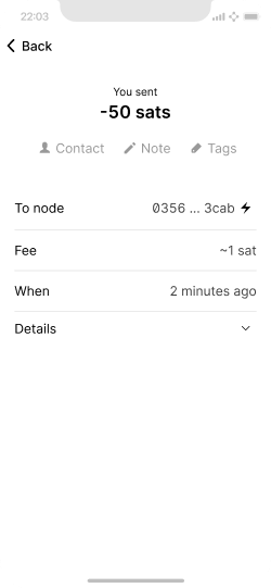
On-chain and lightning payments look structurally similar, but differ in subtle ways.
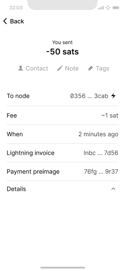
Expanded details of lightning payment.
A payment received on-chain #
While the details for lightning and on-chain payments look very similar, there are subtle differences. Most noticeable for the user is the difference in fees and processing time.
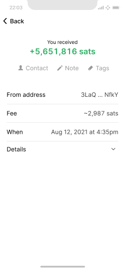
A received on-chain transaction without annotations.
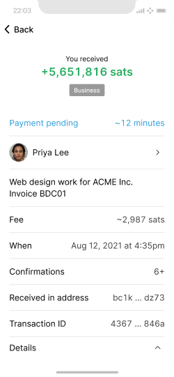
The same transaction with an assigned contact, tags, and description, as well as expanded details.
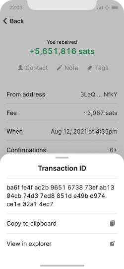
Tapping list items can quickly bring up further details and options.
Status display #
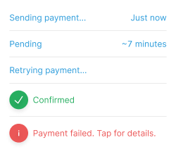
Status indicators are important for on-chain transactions since they take longer to confirm, as well as when things go wrong. While a completed transaction generally doesn’t need a status indicator, it should be shown if the transaction completes while the user is watching. Error messages should be clear and provide access to details and options to remedy the problem.
The recipient field #
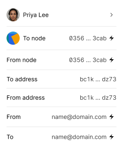
Most intuitive for users is likely when a transaction is directly linked to a person or business. As this requires the user to tag transactions accordingly, there need to be fallback approaches that try to communicate the available technical information in ways that users can relate to.
This can be in the form of text labels, or even uniquely generated icons like Jazzicons. When using visual fallbacks, be deliberate about their impact. If they draw visual attention, but don’t communicate any useful information, you may want to avoid them.
Wrapping up #
As mentioned at the top of the page, there is a lot of nuance in the display of user activity. While this allows for many different small design decisions, users overall benefit if wallets take similar approaches. Particularly when it comes to the addition of metadata that is not stored on-chain or by lightning nodes, it would be helpful if wallets can converge on standardized data formats to allow for interoperability and data portability.
Closely related to activity is the next page about contacts.