The visual language of bitcoin
Since bitcoin answers to no central authority, there is no single symbol or logo that can visually represent it, though many try. Here are some of the most recognized attempts to create a universal logo for bitcoin.
Original symbol #
Satoshi Nakamoto created this lettered golden coin for the original Bitcoin Core client, released on January 9, 2009.
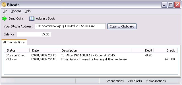
The original logo in an early version of the Bitcoin Core wallet.
Updated symbol #

On February 24, 2010, Satoshi posted an updated icon that adopted the capital “B” with two vertical lines (archive.org, bitcointalk.org). Satoshi requested that all derivative works be placed in the public domain.
Update by Bitboy #

On November 1, 2010, a user named bitboy proposed a new icon and set of promotional graphics on the Bitcointalk forum (archive.org, bitcointalk.org). This iteration added a flat style, the hex color #F7931A, and a 14-degree rotation of the B. This interpretation of the bitcoin logo is still ubiquitous today.
Download bitcoin Symbol #
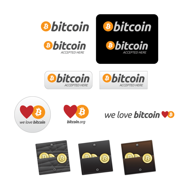
Promotional graphics created by bitboy.
The Unicode symbol #
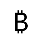
The Unicode symbol for bitcoin (₿) was introduced in Unicode 10.0.0 on June 20, 2017. This important step established bitcoin as a currency symbol alongside the US Dollar ($), Euro (€), and others. As of mid-2021, few fonts support the symbol.
The Satoshi symbol #
As the price of bitcoin has increased, and the lightning network has facilitated low-value payments, it has become common for people to denominate bitcoin with the “satoshi”. See the Units & Symbols section for more detailed information about bitcoin units.
There is currently not an agreed-upon symbol to represent the satoshi (or if there should even be one). However, many ideas are in circulation.
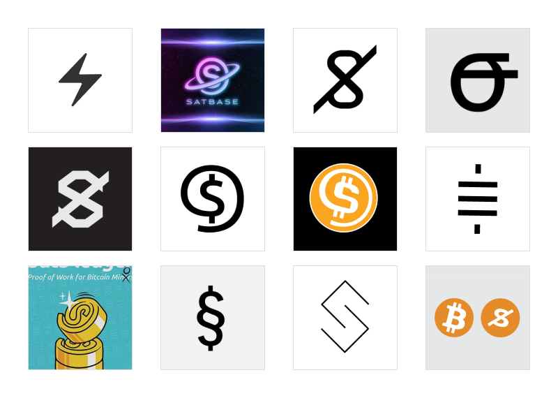
References from top left to bottom right, unknown author, 2, 3, 4, 5, Jeremiah, Alexa, 8, 9, 10, 11, and 12.
Beyond the symbol #
Bitcoin’s permissionless, decentralized, and open nature has led to practically endless representations not just of the logo but of the character and ethos of the community.
Memes #
From moon Lambos to the price rollercoaster, there’s a meme for practically every situation. Certain graphics, stories, jokes, and ideas have won out over others to become recognizable avatars of the community and its personality.
The gold metaphor #
Some of the most common representations of bitcoin are based on Satoshi’s original gold coin illustration. This style boldly makes a case for bitcoin as a transactable kind of digital gold, for which additional elements of binary code or electrical circuits are sometimes added. On the other end of the realist spectrum are heavily illustrated coins like those you might find in a video game.
Illustrations #
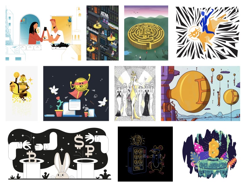
Magazines, blogs, and other publications often hire professional illustrators to visualize stories about bitcoin. Because bitcoin does not have any official brand style guidelines, they are usually only limited by the illustrator and publisher’s imagination.
The expression scale #
Think about bitcoin’s visual language as a scale that ranges from muted to highly expressive. These images look very different, but they all capture bitcoin in some way. As the identity of bitcoin is public and community-owned, all these representations are equally valid. This provides enormous creative freedom to designers and illustrators with their own visions.

In digital product design, there are times when a minimally expressive approach is what’s needed. For example, when a user makes a transaction, we want them to focus. At other times, illustrations and stronger visual elements are more appropriate, and this is where we can take advantage of the creative freedom bitcoin affords.
The lightning network #
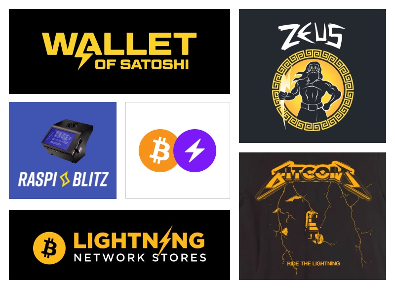
Since the first lightning implementation in 2018, a distinct visual identity has developed around the lightning network based on a simple yellow lightning bolt icon. Sometimes, lightning software and services completely forego common elements of bitcoin branding (the color orange, the bitcoin symbol, etc.) and instead use the color yellow, a lightning bolt symbol, and metaphors for electricity.
Should lightning be distinct from bitcoin? #
While lightning branding can be fun and expressive, it may give new bitcoin users the impression that lightning is different from bitcoin. More accurately, lightning should be considered a different way of using bitcoin, not as a different currency than bitcoin.
Consider your audience #
Are you developing bitcoin products that are intended to be used primarily by developers or people who are very experienced with bitcoin? If so, lightning branding may be a great choice for your product.
Are you developing products intended for bitcoin beginners? If so, consider minimizing or altogether avoiding lightning branding. Instead, focus on what your user needs or wants. For example, the term “instant payment” could be far more informative to this user than the term “lightning payment”.
As you have seen, bitcoin is shaped by its user base. Now, let’s go under the hood with the technology primer.


